Forsaken Paradise
This is a story of two characters that try and discover what has happened to their broken world and save it from darkness and give it the light which is hope.
Link to the game below (Window Version)
https://hollowparty654.itch.io/forsaken-paradise


I was designing the environments, the map, the poster and the coding aspect. I’ve managed to complete them in a smooth render style and that I am pleased with the outcome. What I add is that some areas are at a low resolution and that it needs to be changed and kept within the same resolution. One of the weakness that I have is a large amount of work that I do and that it tends to be too much. From this experience, I’ll limit the amount of work due to the fact that I can focus on one design and try to make better. My strength is to make simple idea effective and focuses on the detail that needs to be added. Also, even if the design does not work well, I’ll still experiment and produce different variety before publishing the final version. If I were to improve, I would need to make sure that the focuses on my time management a bit more and limit the amount of work.
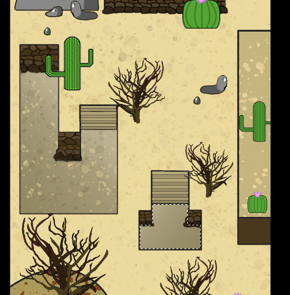
The game has a simple storyline that all players are able to follow and the mechanics work beautifully. With each battle, it neither easy or hard but rather fair so that the player is enjoying the game and challenge themselves to be better to progress with the story. The art style is very unique to view upon for the audience and it is easy to identify what it is and what it is showing. Even though players will encounter some art error where they start to walk over the tree is because the image size and it will cause the game to lag if I implemented into the game. I would rather have some bug than a laggy game to present the audience. It would have been easier to set it up as a tileset but I would like to go for a different approach to see what I can experiment on the software and play around with its mechanics.
The poster shows a beautiful line less art that has different shades of blue. The bright colours are juxtaposed against the dark colours making appealing towards the audience. If I were to redo a poster again, I would look at the different variety of layout and what colours I would be using.
Research
For what I conducted from my research is a lot of references from real life and look at different environments and what style they would go for. The amount of photography I showed gives me enough inspiration for how I want the game to be looking like.


In a game world like this, the majority of the design would come from real life images and adding a twist to it. I would examine a spaceship that looks very rusty and polishing it with a modern look that would be appealing towards my audience. If there was a specific decorative object that I would like to include in my game, I would go out and explore the different type of tree and exploring how they would form during the time.
The only difficulties that I would find if I wanted to get a piece of object that I would have to wait due to the seasons and since I want a specific object. I would have to go to the internet, instead, I will be looking into real-life scenery to further expand on primary research to prove that I went into depth with my game.
I went to the Victoria and Albert Museum where they show a video game display and how developers were showing their own concept of art. I found that very useful as I can have an understanding of how organised their structure of work is. By looking at how the layout is, I can have a better feeling of how I should construct my work.
Artist from different RPG such as Mad Father, the Witch’s house and IB all show beautiful artworks and how they use the colours are very effective. Even though they all are horror games, they still use bright colours to portray how innocent the scenario is and how the character would do in the situation. IB shows childish like style artwork of how they show this innocent girl, and she is trapped with inside a nightmare world where chase her with different types of phobia and personify them as a person.


Planning and Time Management
Throughout the game process and how it functions, I do believe that I managed it very well but I think that there are some things I could have added and spend more time on the extra time such as a second poster and a HUD. However, the amount of work that I have done is plenty of showing my development.
I believe that some coding aspects took longer than it should have and that I needed to be prepared next time so that it is I can do the process more quickly. I was trying to figure out the parallax mapping size as the software was duplicated the images and I didn’t know how to fix the sizes. However, after a couple of day working out the maths, the map would fit itself but I do believe it could have been sorted at a later date.
I mainly focus on the major part of the game which was the environment and once I inputted the environments into the software, I started coding straight away and I knew how I wanted the story to portray itself. I found that very helpful, and I was able to get a lot done during the time that I have.
Developing and Modifying Work
In the beginning, I was using simple trees that formed other RPG because how they used their trees works effectively. However, that may not be the case for me due to the art style that I have. I may need to create them bigger to adjust and make them look unique to fit my art style. Rather than designing one tree, I looked at a variety of different trees that would fit within the selected environment for the game. I also changed some layouts of the environment that would be easier for players to walk around and that it is not complicated.
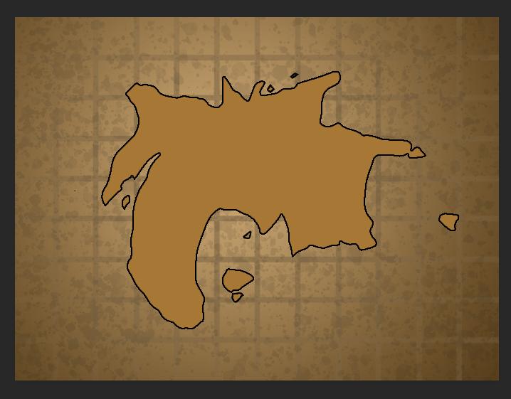
For each environment, I’ve conducted 3 different layouts and I’ve explained why I have created different layouts for each environment. Also, the map design has 20 different variations and the one that I selected was presented on a treasure map that would be later digitalised in Photoshop. Finally, there were 6 designs of the poster but I only chose one to digitalise only because of the limited time that I had left.
With all of my ideas shown in my blogs, I believe that I produced many ideas that I could use for the game and with the selected choices, I was not displeased with my action of picking the design.
I had one particular choice that would be in the desert layout where the character would have to go through a long route to get to the spaceship and go towards the evidence. However, it would take me a lot of time to code it and I believe that the audience would find it boring during the gameplay, so I shrink down the size and change the route to be much easier. I do want to point out that the design of the poster was originally going to be two characters next to a bonfire and behind them is the city sunken in with the sand but since there was a limited amount of time left, I had to go for a simpler version of the poster by making it line less and I knew that this method would work effectively.
For the environment, I played around with different texture that would blend well with the water, grass or cliffs. By adding a clipping mask on the selected area, it blends well with the other environments. I try using different shades to fit the colours for different environment stages to see if I like the colours applied to it or not. If I do not like the colour, I’ll add highlights to boost the quality of the design.
For the map design, it took me a day to completed as I wanted simple and to show my understanding of how to design a realistic map based on other maps in real life. For the environments, it took me 2 weeks as I needed to go back to the design to make sure that it is refined properly and I apply extra detail to make more appealing towards the audience and even though the audience won’t see the design, I will put details towards that are just in case if the audience wants to see the entire layout. The poster, it took me 3 days as it is very simple but it needed to be done correctly as the design needs to be symmetrical. Even though lineless art is effective and simple, I needed to consider the colours that I was going to use and uses the different shades to show the tint and shadow of the colour.
Materials, Techniques and Processes
For my sketchbook, I used a 4B pencil to make the design clearer to see what I have portrayed for my game. It is easier for me to do ideas development on sketchbook as it allows me to give out a variety of design and explore what could be added into the game itself. I also did a collage of what the environment should look like and I used coloured paper and images to display my layout. I did different techniques to demonstrate my understanding of how I want the design to look like and have a proper feeling of when the audience is going to look at.
I had no difficulties with using the materials whatsoever as I knew what I was doing during the process stages. Despite the fact that there weren’t any difficulties whatsoever, I would still like to include a colour version on some of the design to convey my ideas and explain my reason for it.
With colours of the poster design, I didn’t realise that it was going to be effective with the use of blue and black as they juxtapose against each other. This makes a really good contrast between the two colours by making it appealing towards the viewer’s eye. On the other hand, I used the final design for my environment and used them as templates following a grid layout so that when I get to code in the game, it will make the interaction easier.
The Final Outcome
Overall, the game mechanic works beautifully and that the story is easy to tell. The player is to follow what to do, and they will be able to enjoy the game itself. The environments are appealing and the use of colours that have been used is effective and make it enjoyable to watch. People are able to download the game without any problem and it has an easy function on what to do next. The reason for this approach of action is that I want other people to gain access to the game themselves and play through it. If they have any comments that they have, I will be able to make sure it is fixed and I can patch up the game so that they can enjoy the game more.
The game itself is completed and it is upload online in a window’s version. I do have some complication with it the teachers asked if it was imported as a Mac file. Even though it is possible to do that function, it will export it as a bigger file. What I mean by that is, the game that I exported is at 900 MB but when I exported in a Mac file, it exported at 7 GB which some website to upload your game won’t allow it. Which then leads to my research that most people would prefer to play in a window computer rather in a Mac. However, the game is functionally and I do have something that would advertise the game itself which is a poster. Also, there are some bugs in the game where you would walk over the trees itself but if I were to do that, it would lag the game and I won’t have exported the game like that. If I were to have another go at designing the game, I would find another way to make the image smaller or input the images as a tile sheet so that it does not take a massive amount of memories.
The game and the poster was made in the highest standard that is clear for the people to see. There are some areas that are at a low resolution but it works well with the game because I need to maintain the size of the game which below 1 GB for itch.io and Gamejolt which website where you can publicly upload your game.
To conclude this game, it shows potential with the mechanic and the story brings interest as the player will be asking of what happens next. I feel like I’ve managed with the time that it was given to me and if I were given more time, I would add an interesting mechanic and storyline to the game that would boost the quality. Even though there is a lot of products that can easily show what the game is about, I wish I could have done more so that I can show to my audience that there is a variety of achievement services such as posters, website or trailer.
Strengths and Weaknesses
Throughout this project, I have a better understanding of RPG Maker MV now and that I can be producing my own game using my own art style. I do believe that the way of how I design posters are getting better by using line less art to present the game and using the composition to keep the shape align with each other. The poster makes sense of what it is telling the audience and the selection of the typography is bold and powerful to captivate the audience’s eye. They understand that I have for the environment has a slight improvement in the layout and making it unique than other games. The most improved in this project is how I design trees and that I have a better knowledge of the structure of trees and how they would look like if they were inputted in different environments. There are some things that are my downfall to my project and that the texture of the environment. I wish that I had a better understand when it comes to designing texture as they enhance the quality of the game slightly. Even though it is pseudo code, I wanted to know the advance version so that I make the game unique and make it special. One of my weakness in this project to know when something is too much. What I mean by that is, at the beginning of this project, I wanted to create so many things for the game but because with the time that was given to me, I had to remove them and focus on the ones that are important to show for the audience.
Overall, this project has given me improvement in my art style and more knowledge of coding has been shown to me. I really like how the layout is presented and it is easy to understand where you should be going inside the game. If I were to do this again, I would look at all different types of environments and expand what could be added into it and learn some JavaScript to produce plugins for the game.
Conclusions
In conclusions, I am happy with the outcome of the game and it looks easy to play and you are able to have a basic understanding of what is an RPG. If I were to do this project again, I would like to add some elements that I discover in the museum that I research and combine together to show my understanding that I have used my primary research well. Also, if there are some areas that need to be fixed such as the low resolution, I will make sure that some objects such as houses or trees are inputted into a tile sheet to prevent more memory size for the game to be exported.
From this project, I’ve learned how to expand my knowledge on a decorative object such as trees, rocks, houses, cliffs, plants etc. With the plugins that were given to me from Yanfly Engine, I was able to use their codes and input them into the game. Even though it is not my code, it helps me understand the variables and how to translate them into a simple version of the English language. The lineless poster demonstrates how effective it is and by that, I want to be experiment more of this style to get even better in my own art style. The three months that was given to me was acceptable has it gave enough time to code the game to the best of its ability.
Throughout this project, I was able to create something that I enjoy the most which are creating a game. Even though it is my first official game, there are some areas that I feel is empty but regardless of that, it is a good attempt of making a game and with this knowledge now. I will have a better chance in making a game at a faster but more effective way.