Final Posters

Final Poster 1

I started doing the one-point perspective on Tower Bridge. The reason why I have chosen this perspective because you are able to see the road and the architecture on the same page. Since I was actually doing a HUD design, it was good enough to be made as a poster. I used an HB pencil to go over the lines and I did not want the lines to be thick so therefore I made thin lines so that I am able to use the rubber if I made any mistakes.

img_3083

Then I used felt tips to make the picture bold. This will be a good use for digitalising as you are able to capture the image clearly itself. Since I am digitalising this image, I will need to remove all the HUD design in Photoshop.

Screenshot (91)

In Photoshop, I went to the layer of the drawing and change the opacity lower so that I can use the pen tool to make the outline bold. Afterwards, I went to the paint bucket tool and fill the empty spaces. Once I was happy with the colours, I removed the HUD so that I have a  better understand where to position the images. I might use the rule of thirds as it is easier to place the images. Also, I removed the car in the middle as I did not like the design so what I might do is design a better car perhaps a Vintage to along with my game and place it in the middle.

Screenshot (95)

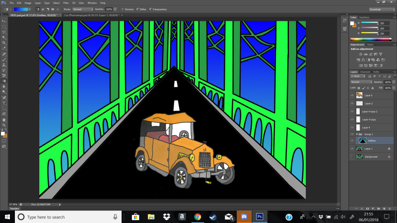
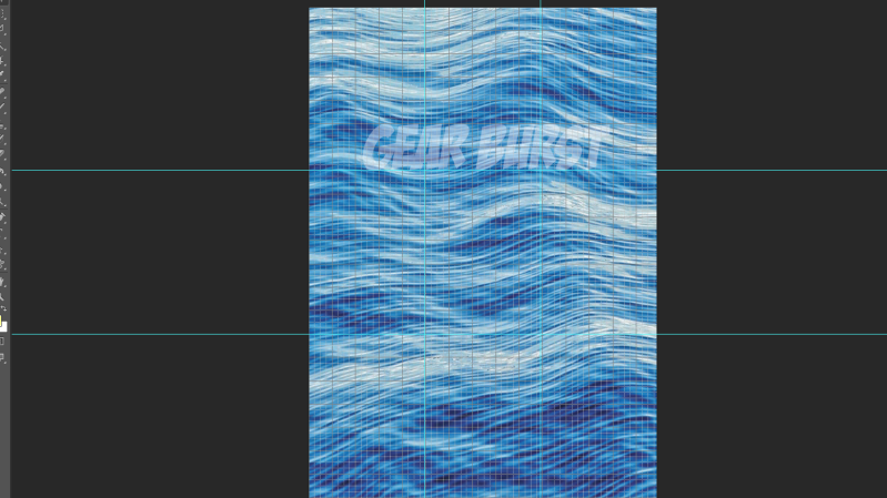
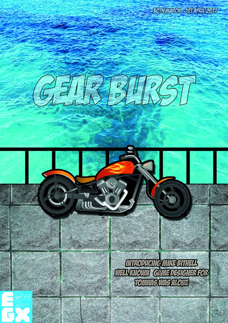
I placed the Vintage in the middle so that it will act as the model for my game. There was a slight problem with the background. The blue will have a dull reaction towards the audience, therefore, I will add a blue gradient to make the poster look interesting. Next, I will try to involve the title “Gear Burst” to advertise my game.

Screenshot (98)

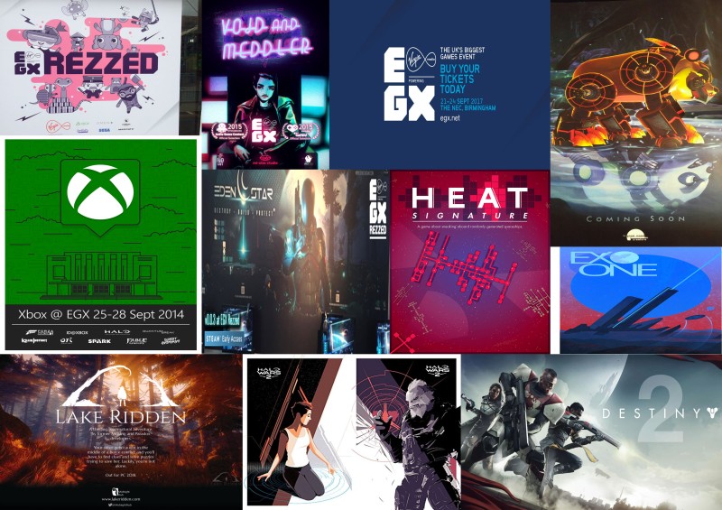
Whilst using the rule of thirds, I was able to position the dates onto the poster and by placing it in the middle makes the poster interesting to look at. Also, I added the EGX logo at the bottom left as it wouldn’t look empty and at least there is something there in the poster.

Final Poster 1

Finally, I made the title to have a light blue colour and I made stroke by 25px so that the title is clear. Also, I made the date to have a light red stroke to make the text juxtapose with the title itself.

Conclusion for Poster 1

In conclusion, the overall result of the posters looks attractive. The use of colours is portrayed very well and it is consistent throughout the poster. The way the image is position using the rule of thirds is used really well and it looks professional. The amount of colours that I used is  6 so that does not overcomplicate the poster itself.  The reason why I did the poster on a landscape is that it wouldn’t look nice if it was in the portrait. The role of the black lines enhances the image and by doing this, it works really well. If it was on a thinner line, then it would slight ruin the image. Gear Burst is handmade by myself, however, it is inspired by the font “Badaboom BB” and the reason why I have used this is that to add originality to my work. To improve, I could have added more tones to the colours to make the poster look interesting and perhaps uses the colours from the Great Britain flag to feature its theme.

Final Poster 2

img_3050

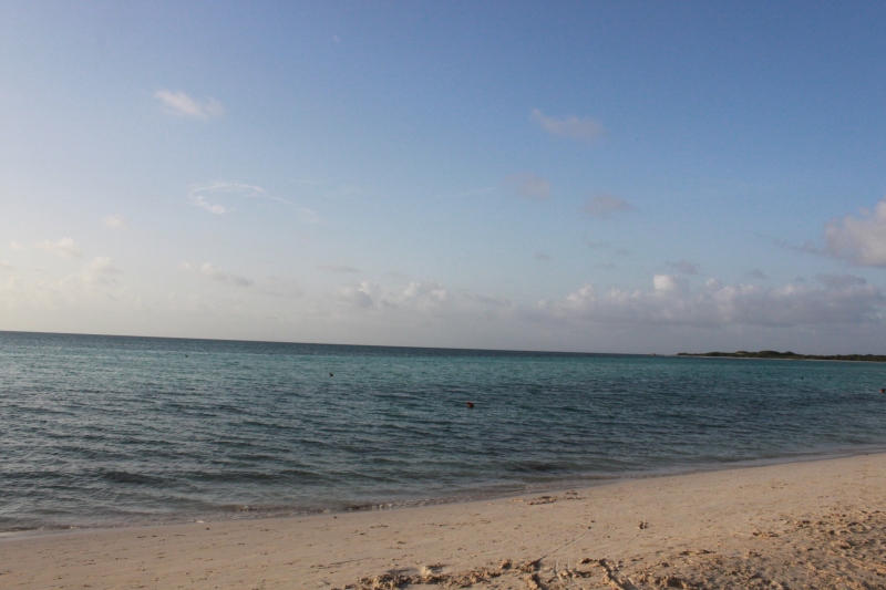
This is a one-point perspective of Canary Wharf. I have chosen this perspective because the layout is grand and the massiveness takes a lot in to explain and it would look good on a poster. I used an HB pencil to get the smooth lines of the buildings. When I am digitizing this environment scene, I could look into creates clouds in the sky so that it does not empty.

Environments (Photo)

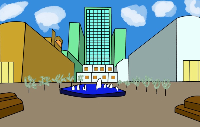
The boldness of the lines is the right measurement as you are able to capture the architecture of this scene. The use of positive colours is colourful and by making this effect will bring attention towards the audience. Different style of brushes brings different effect on the scene, for example, singular dashes to make the leafs of the trees or the dissolved brushes to create clouds.

POSTER 2.png

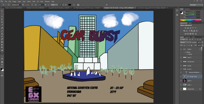
Afterwards. I placed the title “Gear Burst” in a negative colour which is meant to juxtapose against the light colours. This works really well because it will attract the audience with the use of colours. I do not like the font for the date and for the location as it serves no meaning to the poster so what I might is get rid of the address as it is unnecessary information as people will be there at the EGX convention. Also, if I place the date on the side of the building in a point perspective, it will look interesting.

Screenshot (102)

I rearrange with the title, logo and date to fit the criteria of the rule of thirds composition. The reason why I put the title at the bottom is that you are able to see the building and there is nothing overlapping the scenery which majority of the people would prefer to see the building itself. I personally like the idea of the date being on the side of the building however it is not on the line of the point perspective. So what I need to do is to use the point perspective and see how I can change the date so that it looks better.

Final Poster 2.jpg

Finally, I added my car which will allow me to promote my game to EGX and it fits the theme of a car racing game. I managed to place the date in a point perspective view and it works really well as it looks professional.

Conclusion for Poster 2

Overall, the poster is done well made and it looks professional. The typography that I used is “Badaboom BB” and “Impact” which works really well with each other. The one-point perspective shows an interesting view of the building and they all consist of a smooth line which makes the scene appealing towards others. I personally like the architectures that are displayed in the poster which features London in a great way. The thickness of the lines outlines the buildings to a high standard and it is clearly visible which building it is inspired by. To improve, I would have to change the colours of the date to make look interesting rather than having the colour white which makes it look dull.

Comparison

In comparison, the 2 posters are both equally show a high standard at a professional level. By making the poster landscape, it has allowed me to add extra details of the posters such as tones, colours and mark making. In the 1st poster, it shows the car on the road where the game takes place. By making the title appear above the car fits the criteria of the theme itself. Overall, it has a great impact because it was created to a professional level and the boldness of each font stands out which will appeal to the audience. In the 2nd poster, it features one of the architectures in London which was Canary Wharf. The poster itself has allowed the audience to have an understanding of what the game would look like and perhaps the art style will please them. The use of point perspective has worked really well due to the date looking appealing towards the audiences. Overall, the poster looks appealing and the audience will be persuaded by the use of colours that I have selected for this poster.

Photoshop – Content Aware

Image

Beach.JPG

Task

For this task, I was assigned to make sure that the sand is smooth rather than having footprints in this photo. The tool that I used is the stamp tool as it would allow copying the selected area and placing onto a different area. This is used to get rid of a certain image that you don’t want in your photo. I only did the sand area as I thought that everything else within that picture is fine.

Content-Aware Fill.png

Tool

Stamp Tool

Screenshot (103).png

Photoshop – Double exposure self-portrait

Images

Photo on 09-01-2018 at 15.39

creepy-night-forest-fantasy-background-free-thumb43.png

Task

I needed to set the background image for myself to present the double exposure self-portrait. So I want I did was set myself in Photoshop.

Screen Shot 2018-01-09 at 16.01.19.png

First of all, I remove the excessive space that I did not require and kept the important parts. Then I masked the layer so that I and my friend are involved so that the background appears on the screen. Afterwards, I went to the layer that involves me and my friend and I adjust the brightness so that the layer becomes darker. Then I adjusted the levels so that the image is clear to see.

Next, I went to the layer that I selected the layer that is masked and clipped masked the background of the spooky forest.

Screen Shot 2018-01-09 at 16.04.45.png

Afterwards, I went towards the layer that includes myself and my friend and I changed the option to normal to overlay to show the background image.

Dodge Tool

Screen Shot 2018-01-09 at 16.18.08

Finally, I went to the dodge tool change the setting so that shadows was at 100% exposure and the brush size at 700 px and the hardness at 0%. This will show the brightness on me to show the contrast between light and dark.

Screen Shot 2018-01-09 at 16.18.17

Burn Tool

Screen Shot 2018-01-09 at 16.17.59

With this tool, I can make the brightness level darker. So what I did next have I changed the range to midtones and change the exposure to 25%. I applied this tool to my friend which came out to be an interesting outcome.

Conclusion

Double self-portrait.jpg

In this image, you can see the image is juxtaposed against the light and dark area which make look like the yin and the yang. I personally like the visual and the art itself works really well. The stars give it an interesting effect on the image. To improve, I could try different colours to see what effect it could have on the image.

Photoshop – Asset management

Task

Screenshot (101).png

In Photoshop, you will need to sort out your files which will organise your work and it will make your lives easier.

Export

In this files, once you have finished your work, you upload it as a PNG or a JPEG to show a printed copy of the file.

Images

In this files, these images are used in your work and it can be used as references.

PSD

In this files, this file can be used to edit and comment on your work.

Screenshot

In this file, it will help you record on what you have done in your work.

Mark Making

Task

I was asked to produce a series of patterns that would be suitable for the car racing game and why each individual mark making is used in the game. Each mark making comes in different styles such as continuous lines, expand, overlay, rhythmic, dots and etc. These are used to make the appearance of the game whether it’s the terrain or architecture etc.

Here is the pictures that I have done using pencils, graphite pencil and chalk:

I started experiment different kinds of mark making to see what effect it can do whilst design the art style of the game. Most of the mark making seem to be patterns which can be later used characters, scene, props or attributes. Throughout this exercises, I have learnt how to control my hand when drawing and how important is to select the right materials to work with. In this case, the softness of the pencil and the pressure on the paper are very important in order to achieve the required outcome.

The white background was easier to record the patterns using different surfaces. I used a graphite pencil and normal A4 printer paper and I place the paper on the chosen surface and rubbed on top of it with the graphite. It was much easier to do that on this type of paper as it thinner comparing to the sugar black paper in my second attempt.

In my second attempt, I used a sugar black paper and white chalk to record the patterns to the mark-making process. As I was rubbing the white chalk on the different surfaces, I found it hard because I needed to apply more pressure to the white chalk to get the good outcome. Overall, I am pleased with this experiment as I raise my awareness about materials, textures and patterns. This experience will help me throughout the project.

Poster Moodboard

Mood board

Poster Moodboard

These are different posters that have been shown in EGX to display the upcoming games. Some of the posters have a theme that would be represented for the EGX. For what I need to do since the theme of the car racing game is about London, I would need to include an architecture that is popular in London and add in my style to give it originality.

Colour Swatch

Slide1

These are the colours that I will be presenting my posters. I personally believe that it is suitable for the posters that I will be displaying for EGX. The use of light and dark colours will be useful as it is colourful and it is interesting to look at. The reason why I am going to use black on both of the posters because it will help give it a bold look which makes it easier to look at.

Car Racing – HUD

What is a HUD?

HUD stands for Head-Up Display. They are used to show information to the player on what is happening in the game. In this case, a car racing game needs to include laps. maps and numbers of competitors in the race. Sometimes, they would include pick-up items for animated car racing game.

Moodboard

HUD moodboard.jpg

In this mood board, the hud has been positioned in different places so that the player can see what is happening in the game. Some HUDs are placed differently that would allow the players to get used to their game’s preferences of the HUD. What I need to do next is to try out different combination of the HUD so that it is not a bother to the players when playing the game.

Colour Swatch

Colour swatch for hud.png

This is going to be the colour swatch that I will be using for my HUD. The reason why I would like to use primary and monochrome colours because I want to keep the HUD simple and I want to make sure it is not distracting the player whilst they are playing the game.

Draft Versions

These are the different combination of the HUD so I might take into consideration of design it. I tried placing them at the top, bottom and sides and some of the combination work really well. I decided to go with option 2 as you are able to see where each HUD design is and they are evenly spaced out with each other. Also, it will allow the players to concentrate on the race and that they would even have enough time to look where they are going.

Concept art

I started doing the one-point perspective on the page and started designing the road and the bridge. Then using an HB pencil, I gently proceed to draw the structure from the vanishing point so that it the appearance looks attractive. Afterwards, I added details which could be suitable for the design for the HUD. Also, the features that are important in the HUD will be displayed on the page where the audience can see what the game looks like.

I used felt tips pens to make the gameplay stand out and the use of colours used to display the HUD is colourful and attractive. I made sure that the HUD is clearly visible and it is easy to look at. The audience will be able to tell that this is a car racing game.

Digitalise

HUD JPEG

I scan and digitalise the image whilst using Photoshop. By digitalising this artwork, the audience is able to understand what the general aspect of the game looks. I made sure that it is in 3rd person view as you can see the track and the character as well. This track is meant to show the character going through Tower Bridge and there is a waterfall coming from the top of the bridge.

Car Racing – Controls

These are different platforms that I would be using to display my games. Even though I am using well-known platforms to advertise my game, I am going to include my own controller to make it my own originality.

PS4

Xbox One

Nintendo Switch

My own controller

Screenshot (68)

I have designed the controllers that I think it would be suitable for my car racing game. I made sure that the controller is like a steering wheel to ensure that the player is part of the game. I have set the controls on the top of the controllers and I make sure that there are triggers at the back of controller so that the players have an easy access of where each button is on the controller.


Poster Designs

Poster 1

Screenshot (11)

I’ve set the grid to a rule of thirds to make easier to place images inside that grid.

Screenshot (12).png

Then I decided to use a sea background to present the river and I would later add a bridge on top of the background to make it look realistic. Also, I make sure that the title is on the top the grid and make sure that I change the option to from normal to the screen so that it blends with the sea.

Screenshot (13)

I changed the sea background as it was dark and I wanted that background to be brighter so that the text is clearer. Then I use a cobblestone background to represent the pathway of the bridge. Afterwards, I use the pen tool to draw the fence which makes the design look interesting. I also added the date on the top left corner of the poster design.

Screenshot (14)

Finally, I added the bike which I placed in middle and by doing this, it fits really well.  Then I placed the “EGX” logo on the bottom left corner so that it images is clear on the poster.

Poster design 1.jpg

Overall, the presentation of the poster is aesthetically pleasing and the colour scheme blends really well with the sea and cobblestone background. The bike gives a cartoonist look which applies to my car racing game. Then there is an introduction to the game develop, which people will be willing to know what game they have created and what’s their journey during the development. To improve, I need to make sure that the date is brighter and bigger so it is more clear for the players to see. Also, I need to import one of my design to this poster to advertise my own game to the poster.


Poster 2

Screenshot (69)

First of all, I used a pink and black gradient tool to cover the background. By using this colours scheme, it gives an interesting concept.

Screenshot (71)

Then I placed the EGX logo on the bottom left corner and I used a gradient tool to make it different from the background. I also added a stroke to the logo to make it stand out.

Screenshot (72)

Whilst using the grid, I used the text tool to place inside the grid to place all the information for the EXPO convention.

Screenshot (73)

Then I placed my own design in the bottom right corner to advertise my own car racing game.

Screenshot (75).png

Finally, I added the logo of my gear to advertise my own car racing game.

Poster 2 (1).jpg

Overall, the presentation is really colourful and how the light colours juxtapose against the dark colours works really well. The way the composited the text on the poster is to align really well and it makes the poster look professional.  You are able to see the where the convention is and when it is going to beat. The information does not overlap with each other and it is easy to read. To improve, I should make my design of my character have an outer glow to make it even stand out more and change the style of my design to make it look professional.

More posters

Screenshot (89)Screenshot (91)Screenshot (98)Screenshot (92)

Screenshot (102)

Screenshot (95)