Interactive Map – Graphic Designers

Massimo Vignelli

Image result for Massimo Vignelli

In 1931, January the 10th, Vignelli was an Italian designer who had produced package design in houseware design and furniture design. He studied his own personal art style and architecture before heading to America. He established the Vignelli Office of Design and Architecture in Milan along with his wife Lella Vignelli in 1960.

Massimo Vignelli.jpg

For his style of work, I can see he uses a lot of compositions for his typography and design. Also, he tends to keep a limited colour scheme which does not complicate his design and he wants his audience to identify what he is displaying for his art.


Image result for massimo vignelli map

This is the New York subway system that was made in 1972 which follows a 90 and 45 degree. From looking at this, the design aspect is very simple and how he uses the colours is very effective by making the train line bold and making the background very light so that the train line stands out more. I do like the distance of each town’s name which makes it accurate. The materials that have been used to create this map was pencil because I believe that he needed to plan how the subway system was going to structured and later on digitalise and printed to be displayed to the public.

Video

This is Vignelli speaking about his thought process of how he was designing his map.  In the video, he explained how each stop has a dot and he said that the geography does not need to be literal and people at New York does not need to be confused.

Paula Scher

Image result for Paula Scher

Paula, an American Graphic Designer, was the first female principal at Pentagram. She is one of the most influential graphic designers in the world. Her art style conveys pop cultures and fine work.  The works seem to be smart and accessible yet iconic.

Paula Scher.jpg

In her work, she plays around with typography a lot and to capture her audience’s view by making the words bold. The typography is position in different places and some of them are rotated so that the design is viewed as appealing. She has famous people that have used for her work to boost her work and the culture for other people.


Related image

Scher’s poster shows a variety of typography and a limited colour scheme to display their work. The size of typography is changing constantly but each text is readable and they do not over obscure with the design aspect.  The message that they are trying to convey is trying to make famous people stand out and making a name for themselves. The medium used to producing this design might have been digitalised because the text needs to be accurate for the composition to work.

Interactive Map – Kiosk

Task

Kingston Fiesta Kiosk

These images have been created from the prototype application that I made in Abobe XD. With the skills that I have for Illustrator, the kiosk will be done in 10 minutes.

I have chosen the splash screen, the selection page and the information page because I believe that these are vital information that I want to display to the public so that they will be able to understand what is my kiosk is about.


Screen Shot 2018-12-04 at 10.19.00

Since I needed to make my rectangle to look 3D, I would to go on the extrude and bevel option and make sure that the setting is correct for each individual shape. In order for my images to be aligned within the new 3D environment, I would have to convert the image to a symbol so that when I am going to the map art, I can input the symbol so that it forms a kiosk.

Screen Shot 2018-12-07 at 10.41.02

I just realise that my design blends with the background and that does not look as appealing and shows it is lack of creativity to my work. I might play around the colours and use the colours that I have used for my app design to show my consistency with my work.

Screen Shot 2018-12-07 at 10.41.34

Even though it is a slight improvement, it still blends with the darker blue so I might decrease the blue to a more grey area so that it is easy to see that the colours are not blending.

Screen Shot 2018-12-07 at 10.41.57

The grey blues standouts and it works very well, however, I still want the pattern design to appear on the background as I have used it on my app design and I do want the design for my kiosk to look interesting so may consider playing around the colour.

Screen Shot 2018-12-07 at 10.42.18

I like the pattern on the background with the new colour but I still think that the colours should be switch around so that I have a different perspective on the design and by making that decision, my design will look aesthetically pleasing.

Screen Shot 2018-12-07 at 10.47.32

Blending with black with the grey-blue is a good idea and when I have that linked up with the pattern design, it will make the kiosk stand out even more but also making the background engaging to view upon.

Screen Shot 2018-12-07 at 10.56.19.png

Overall

The appearance is appealing and the simple design is easy to read. The colours that have been used here is efficient and the colours compliment each other well as they are complementary. In order for me to improve, I could do my own illustration of a person interacting with the kiosk or do some extra detail on the kiosk so that it could interesting to view upon by other people.


Interactive Map – App Design

App

Interactive App

Task

For this project, I had to design an app that would advertise my interactive map. By making an app, it would help my understanding with designing from different platforms such as websites and leaflets. On Adobe XD, this software allows me to produce apps on a computer or an ios application.

Firstly, I copied the front page of my leaflet as I thought it would be a good idea to display what my app is about and the front page is aesthetically pleasing. When I was going through the tutorials, it shows the steps of how to make a selection page and it looked very basic. I did not like the approach of how basic it is and if I did that way, it would not show my creative side so I decided to use plates as a selection page and it works really well. I just need to adjust the size and I will be using a “blue” text that would go on top of the plates.

Screen Shot 2018-11-20 at 10.34.14

This is how my splash screen and my selection screen is going to look like. I am pleased with the results and the design aspect looks delightful to watch.

Screen Shot 2018-11-20 at 11.05.54

I made a side selection as I had so many information about the places. For these side selection, I made the basic but I colour coded theme so when people are viewing my app, it is easy for them to read. I made categorise logos as it is people are able to understand what they if they do not understand English.

Also, for the bottom menu, I made sure that I keep within the colour scheme as I do not want my design to be complicated and it will ruin the visual aspect of my design if I changed the colour.

Finally, the cross is meant to represent to go back to the previous page if they wanted to go look at other information. I used the same colour as the title colour to keep the colour scheme limited.

Screen Shot 2018-11-27 at 10.52.15

For the information boxes, I like the design of it as it looks like a menu design and a menu would be suitable for my app which is a food theme interactive map. However, I was undecided on what colour I should use for the menu design. I will try a different variation of colours and talk about what my opinions on each design.

screen-shot-2018-11-30-at-09-39-28.png

I do not like the colours yellow as it is too bright on my design and since I want my viewers to see the information and I want to categorise each section so that it is easy to read.

screen-shot-2018-11-30-at-09-37-59.png

This is the best version of the menu as you can see the information very well and I am using the same colour that I have used for my other pages which help keeps the colour scheme consisted.

Screen Shot 2018-11-30 at 09.40.51

The orange blends with the background and it will be very difficult to see what is happening.

screen-shot-2018-11-30-at-09-40-04.png

Even though the red stands out and it looks appealing, it will be a complete change with the other changes and it will ruin the consistency of the work so I will keep it the colour blue.

Screenshot (88)

On the other hand, I decided to change the bottom part of the menu to a categories food places because on the other design, I had the map repeated for the top and the bottom. To avoid any confusion, I place the logo of the food place at the bottom.

Screenshot (89)

Finally, I made sure that the keyboard is blue so that I am keeping the consistency with the design and each letter is readable. It fits that within my design and if I were to redesign the keyboard, I would add some food logos on the keyboard so that it fits within the theme even more.

Overall

In the end, the design looks aesthetically pleasing and the colour scheme is kept consistent and the structure is aligned evenly. Each page has the same background and people understand that the app will be about food. If I were to improve anything on the app design, I would make sure that I have more ideas so that my app would look more interesting and it will have a unique design.

Interactive Map – Leaflet Evaluation

Task

For the leaflet designs, I had to produce 6 different ideas for the leaflet design and I had to link it to the theme that I have chosen which is food. I had some inspiration at Pinterest and I had a go with some drawing of different food and some information boxes to make it more creative and unique. Even though they are in bad quality, I could play around in illustrator and make sure the lines are smooth or create a lineless art that would be appealing toward the audience. I might not use the exact idea but when I could pick a page that I like and combine it together to form a leaflet. When producing ideas, I realise that the order of the leaflet was slightly wrong, however, when I am designing in illustrator, I can rearrange the order that it is in.

img_2669.jpg

Ideas Development

img_2659

I perform a draft version of a leaflet to see I can like it, however, I can’t seem to improve my ideas since it is simple. I might play around in illustrator with the tool that is given to me. I am not a big fan of the anatomy of the figure is the proposition is uneven but perhaps I could configure the size in illustrator.

img_2660

For the information that I want to put in, I personally like the top 2 as it gives a sense of uniqueness and the design make it look delightful and suits within the theme that I am working. On the other hand, I might have to consider the design for the bottom box as I am trying to portray a rating system of how this leaflet is good or not but not a lot of people would have understood what it means so perhaps I need to reconsider what to change about the design of it.

img_2661

First Draft

Screenshot (68)

This is the front page of my leaflet. The design aspect with the front page is simple and I really like how the smooth the plates are and the colour used in them is presentable. However, the front page does not presentable and some of the fruits does not look even. I had a look at examples of leaflet design and it does not look like a professional standard.

Screenshot (69)

For the back page, the white brushes help enhance the visual aspect with the idea of the page and the two information boxes really give off a nice touch to the page. On the other hand, the bottom box with the start does not fit within the theme of my interactive map so I might have to consider what I need to change for the bottom part of my back page.

Screenshot (70)

Lastly, this was meant to represent a menu so that when the person is using this leaflet, they are able to write down what they would have for each section. However, I realise that the map has no information and if I were to apply the information onto the map, it would look compressed and would not look appealing towards the viewer so I might have to consider a new design that would look appealing and would share information about the map.

Finalise Draft

Screenshot (72)

This is a much improved first page that before and it appeals more attractive with its visual aspect. For the other pages, I would make sure that they have the same background as the map as it brings continuity to the work and it is easy to read. I changed the typography to Cooper Std as it brings a bold appearance fits within the theme that I am displaying. With the waiter design, I used the one that I have created on the map and use it on the main cover so that I do not have to overcomplicate the design of my leaflet. Finally, I consider having white stroke lines around the blue circle to give my style of the leaflet a sense of uniqueness.

Screenshot (72)

For the back page, I kept the top two information boxes due to the fact that I personally like the design but I just need to make some slight adjustment to their design as their previous design was not smooth. As it was a food theme leaflet, a food cycle would recommend best for the leaflet and I believe that it can be educational for other people who do not know the names or what is inside the food cycle. The illustration is lineless but it works effectively because even though that the design is simple, the food is easy to identify and it is aesthetically pleasing.

Screenshot (72)

For the inside page, designing banners for each information about the map was a good idea as people will be able to identify where each location is on the map. The reason why I have colour coded each section in different colours because people tend to find information if it was colour coded and it is a faster way to spot different information. Refined the logos for each section is very amusing and satisfying to view.

Printed Version

img_2662

This is what my leaflet would have looked like if it was printed on an A3 paper. On the paper, you could see lines that would fold the pages. This was a problem that I can easily fix on illustrator by making the whole template have the background rather than having for each page as it will cause difficulties later on.

Conclusion

img_2655img_2656img_2657img_2658

Overall, I like how my work was able to improve and the visual aspect is charming. The information was not too much and kept it consistent so that people know what is going on that page. The first page looks like a menu and since my theme is food, it works perfectly and I believe that it has reached the criteria. If I were to improve on this leaflet, I would make sure that I add more information to the map such as time and the synopsis of the location name so that whoever is reading this will have a better understanding of what that place is.

Task 3 – Realisation Map Project


Task

Screen Shot 2018-10-30 at 09.57.42.png

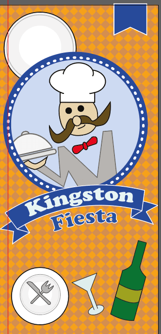
I selected a region in Kingston that I think it would be suitable for all the food places that I have in mind. The drawing aspect was not traced but I drew from observation to make sure it was own originality.  I used an HB pencil and refined it with a 0.8 fine liner to capture the boldness of the roads. The reason why I have chosen this location is that many tourists come to popular town such as Kingston and they would like to know the nearest restaurant, cafes and etc.

Screen Shot 2018-10-05 at 10.25.01

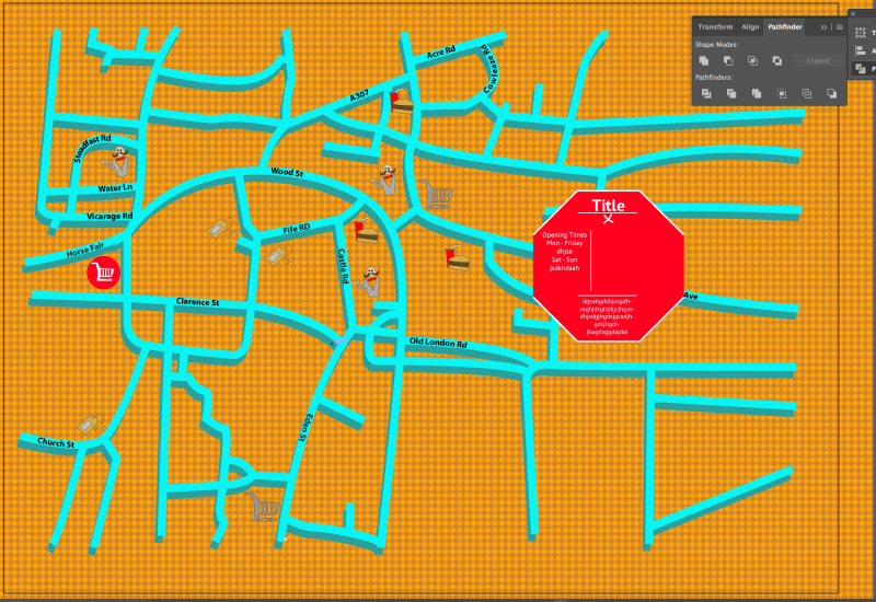
In Abobe Illustrator, the software is a vector based program create artwork without distorting the resolutions. Since the map that I drew is a template, I used the pen tool to go over the road and increase the stroke size. I chose light blue so that it would compliment with the orange background. Patterns would be more aesthetically pleasing and would appeal to the audience. I chose a diamond because it would fit the theme of my interactive map. The diamond’s opacity is at 20% due to the diamond overpowering the map and it would be very hard to see the road’s name.

Screen Shot 2018-10-05 at 10.27.12

For the road’s name, I use the pathfinder to adjust the words onto the lines so it gives a clear perspective on where everything is.

Screen Shot 2018-10-05 at 10.28.42

With the pattern’s shapes proportions reduced to a smaller shape so that it does not get in the way of the view of the roads.

Screen Shot 2018-10-09 at 10.49.11

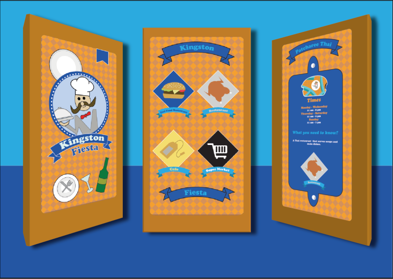
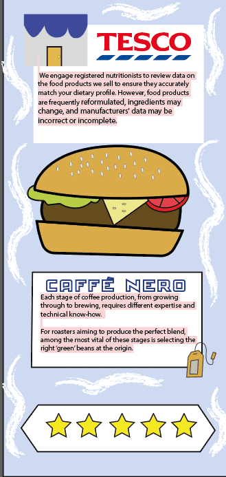
Onto the logos which I had some complication with the design as it was very hard to see. It wasn’t the fact that it was the wrong size, it was colours that was blending with the background. So I need to change the design of the logos slightly in order for my logos.

Screen Shot 2018-10-11 at 15.22.53

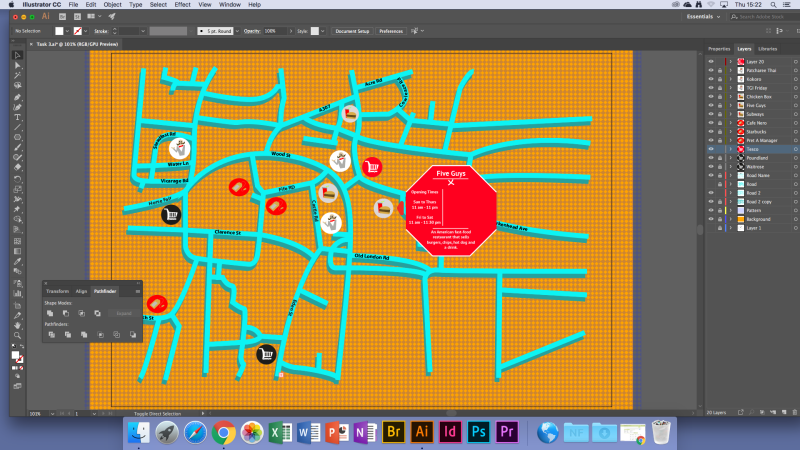
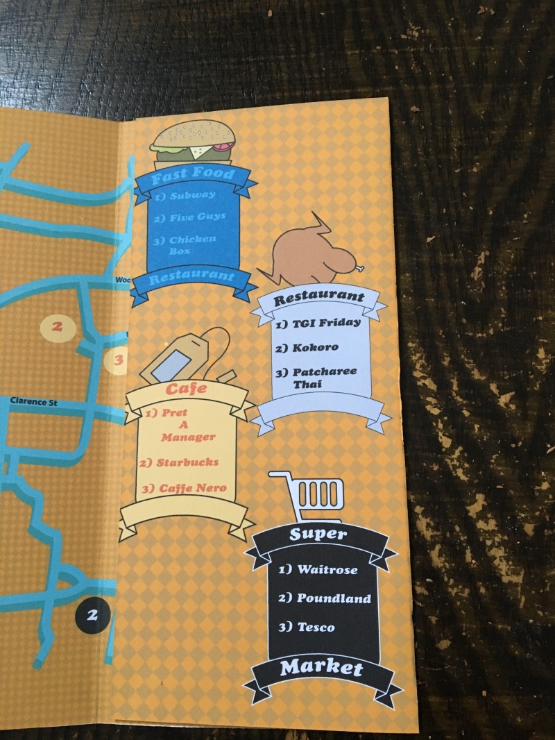
What I decided is that I create is a base for each individual logos so that it stands out a bit more. I would make sure that each base would link to each category of the food location that I selected. I also made sure that the base colours of the logos do not blend with the background and it stands out from the rest.

Screen Shot 2018-10-11 at 15.23.44

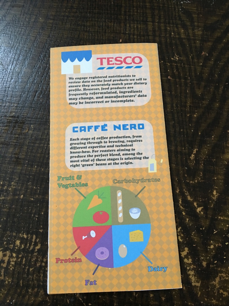
I have inputted all the bases for the logos but as I was looking through the logos, I recognise that the colour scheme between the base and the logos is that they are very similar and its blends with each other. I would make sure that the base is changed and it is opposite from each other. For the information boxes, I chose with a simple design as I do not want to over complicate with the viewers and chose only a limited amount of colours so that the map is not overpowered. However, I might put into consideration of changing the opacity of the information boxes as I need the map to be dominant.

Screen Shot 2018-10-11 at 15.28.23

Whilst I am working on my information boxes, people will need to know where the boxes are pointing to so I designed an indicator which to allow the viewers to see where the information is pointing at. I made sure that that the indicator is the same design as the information boxes to avoid any confusion. How I made the indicator is that I created a square shape and then I placed a triangle onto of it which allows activating the Pathfinder which divided the shape to form an arrow and I used the anchor points to make the edges curved to give a more pleasant appearance.

Screen Shot 2018-10-11 at 16.37.30

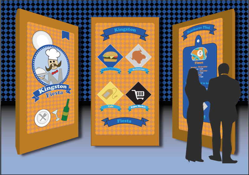
Once I was happy with the design of information, I started to placed them all over the map. It took me some consideration to change the opacity of the boxes to give it a clean look.

Screen Shot 2018-10-18 at 09.18.58

For my looping animation, I made a burger mobile to fit within the theme of food. I have created the designs in and implemented the burger in Animate. In order for my looping animation to work, I would have to convert to a movie clip and then I produce a Classic Tween Guide which will allow me to use the pen tool and design a way for the car to move. So once I was happy with the movement, I moved the keyframe further away so that the motion is slower.

Screen Shot 2018-10-18 at 09.38.53

Since there must be sounds inputted into my interactive map so I thought I would go for the crunchy sound like for someone eating because it fits perfectly for the theme that I have chosen. I grabbed an example from this link ( http://soundbible.com/free-sound-effects-1.html ) and I went with an apple crunch as it is not too loud. When I have implemented the sound into Animate, I thought that it was too loud and I do not want to damage anyone’s ears so I went into Abobe Audition and decrease the amplifier to have a quieter volume than before.

Screen Shot 2018-10-30 at 09.44.54

During the testing, I went over to see if the button was in operation and they all corresponding when the mouse interacts with it.

screen-shot-2018-10-30-at-09-45-12.png

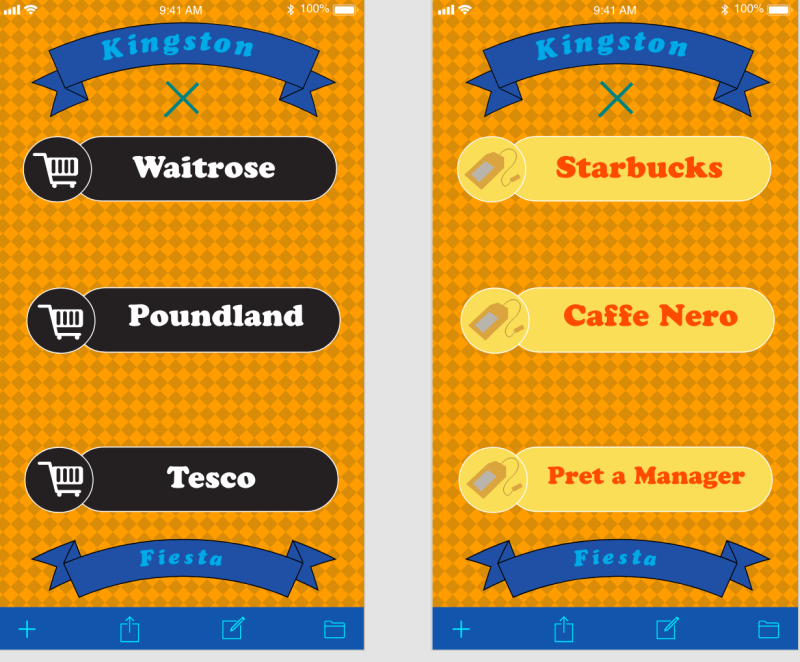
When the mouse goes over the logos, the base’s colours change to a different colour which means the interaction is working.Screen Shot 2018-10-30 at 09.45.15

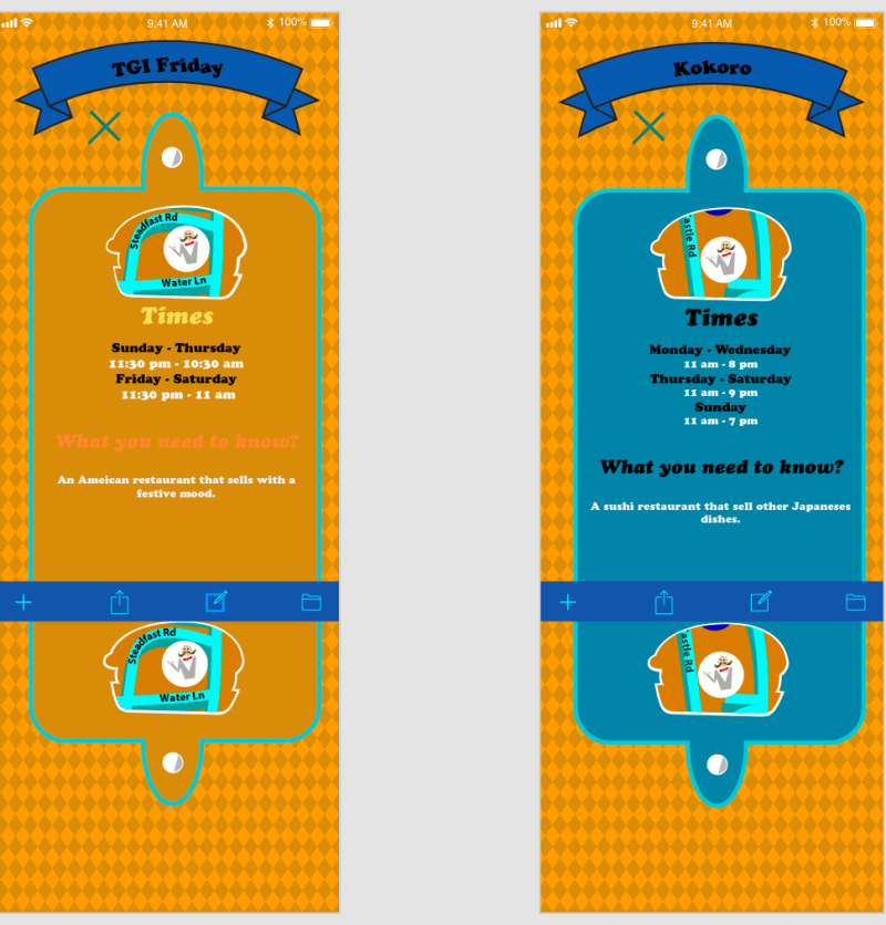
Once someone interacts with the button, the information boxes will pop up and all the information for the viewers what this place will have in store. As you can see that each frame the burger mobile is moving across the map like it’s driving on the road.

Screen Shot 2018-10-30 at 09.45.26

The mouse highlights the logos and the reason for this is because it will directly send the viewer to the link of the restaurant or a food place. This is for the extra information for the viewers to know a bit more about the restaurant itself.

screen-shot-2018-10-30-at-09-45-48.png

Every logos inside the information boxes is able to send the viewer to the specific link address.

Evaluation

Ideally, the colour scheme fits very well and it is colourful. The pattern choice has been selected wisely due to its simple design and proportion control. The logos have a simple design, however, it is clear to see what they are and what they linked to. I made sure that that the design is not complex. Even though I like the design of the map, there are bad aspects of it as well which is the information boxes. It’s very plain and the design of it is just an octagon. If I were to change the information boxes, I would make sure it would be fit the theme and If I follow that, it would stand out even more.  The looping animation really fitted the theme of food places and the proportions sizes of the burger are controlled and the design shows a form of uniqueness. Finally, the sounds show a crunch effect which is at high quality and it is not too loud for the audience to hear. Overall, the appearance of the interactive map is bright and colourful along with its simplicity which gives a sense of delightfulness. If I were to improve on the design of the map, I would make sure that the information boxes fit within the theme of the selective category and I could try to implement different fruits onto the background and try to use the combination of colours to see what works.