Task
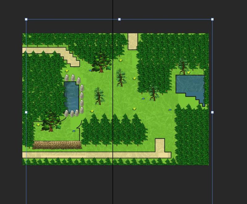
The forest scene is one of the biggest levels in the game and I want to make it appealing. My aim is to make this level colourful and vibrant. Also, I will be playing around with the tint effect within the software, so when the character is zoomed in a certain section of the map, I need to ensure that it is in detail with a good resolution.

With the layout of the forest, I really do like how it is spacious. The amount of tree covered in this level is suitable because it gives a sense that you are in a forest and gives the player enough space to walk around the area.

I started off by outlining the pathways, the river and the hill. Then I used the same rock wall that I did within the desert and applied it to the hill. However, I applied a brighter colour that resembles the colour of the pathway. Afterwards, I wanted to have a shadow in the lake area, so I use a darker blue on the outer part and use the smudge tool to blend it in together. Then, I used a different grass texture comparing to the town level to change the outcome and make it look different. I did that because I wanted the game player to get the feel that they are in a different location and that they have discovered something new.

Once I was finished with the small amendments on the scene, I started placing the trees of where they should be. When I was doing the measurement, the distance with each tree was 14 inches away from each other and I kept doing it to keep consistency. Once I got a line of trees, I copied a series of them and started to duplicate them on the ground, whilst maintain the equal distance from the path.
When I was working on forest earlier, I’ve received critics that I should change the grass texture as it was too big for this level to be visible.

I chose the texture with a better quality from a free images website and I resized it to fit well with the surroundings. Comparing this texture and the previous one, I prefer the second texture as it is clear and has an appropriate size.
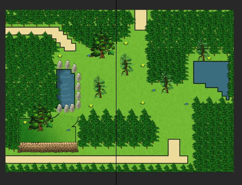
Once the texture has been set, I reduced the opacity and went towards the hill section. I notice that there was a colour error that ruins the realism of the forest. So what I did was closed off the area of where the hill is situated and applied a dark to the light gradient in green hues at a directional point and shaded that area to make it stand out. Once it has been made, I erase the black line and use the smudge tool to blend it with the light green grass to create this illusion that the gradient was always there.

Whilst at the rock section, I found it dull as the initial arrangement of the rocks was having them in the same size lined up around the lake as a neckless. I have changed the size of the rocks and flip some of them horizontally. I also placed some of the rocks on the top of each other and turned their position slightly to the left or right. all of them were position different but how they look was the same. Once it was done, the layout of the rock section became more appealing to the viewer.

Finally, I relocated the trees to even out the area. I resized them appropriately in order to form a Nice balanced composition. Then I applied to the lake water texture to enhance the quality of the image and make the outcome more engaging. Also, I applied the same sandy patter on the path as the one I have created on the beach and the town level to show a consistent approach. I am pleased with the outcome of the scene as the colour used in the forest is vibrant and enticing. When the trees are put together, they look very nice and the formation is spot on. If I were to do this again, I would make sure that I develop a sense of putting grass patches to boost the quality of the environment and adding shadows underneath the trees.
Ruin
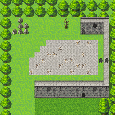
The ruin level is a small level that is connected to the forest and I separated it from the forest in order to design it as a close up scene, which would look professional in an RPG.
The scene with the ruins, will have the same trees as the forest because it is close to that environment. As has a smaller scale and it will take me less time to sort out the tree arrangement. Everything else is very simple to design and the reason for its simplicity is that the characters can find what they were looking for in the beginning.

Once, I’ve set up the colours, I wanted to pay attention to the hollow tree because it will be the main event for the character to interact with. The tree is big and I used a wooden texture to give it a rough look and imply the idea that it is very old. I also added a branch to indicate that the tree is really big.
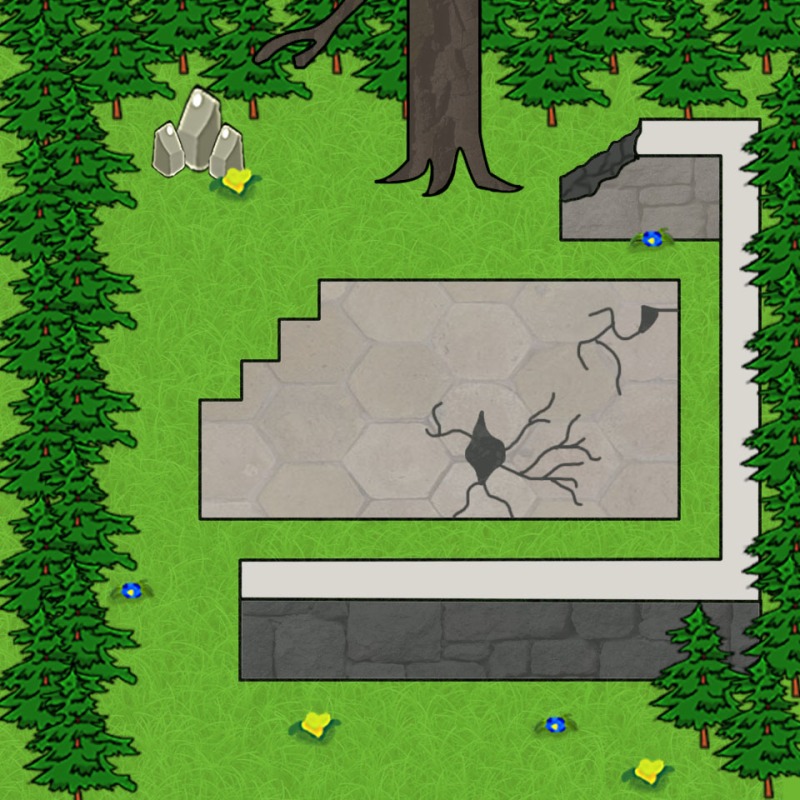
Overall, the design of this scene is simple yet unique and that it is easy to understand what is happening in the game. I like how the hollow tree came out with its rough texture as it adds a sense of curiosity to why it is in the ruin level. If I were to improve this scene, I would make sure that I would change the broken tile on the floor and spent more time on it to give it extra details and perhaps seeing columns would be beneficial for the walls as well.
