Task
For selecting the map design, I selected the one that has looks like a treasure map because out of all the other designs, this one looked more realistic than the others. So once I’ve selected the map, I’ve imported to Photoshop and starts to outline the map.

Once the map has been outlined, there was something that I didn’t like about the map as the lines were too thin and the colours of the map were very dull. Perhaps, I will need to try out in Illustrator as they have a method to auto trace the image.

When into Illustrator and traced over the map. Once been traced, I knew that I was liking the appearance of the map. In some areas have thing lines but soon later to transition into thicker lines and I find that very unique. When the map was done, I will import the image to later expand its design.

For the map’s background, I go for a treasure map’s colour swatch as I want the player to feel like that when they click on the item, they know where they are. The use of radical gradient has been used to highlight the colour in the middle as that’s where the main attraction should be.

Then I add a grid behind the background to give it a slight effect that you can pinpoint the direction of where the player is at in the game. I made it in a different colour and made sure it blends with the colour of the background so that it is hardly noticeable. What I will do is set the opacity to low and use the eraser tool to rub out the outer part of the grid to make it more presentable.

Next, I used the blob bush set and reduce it’s opacity so that I can recreate this older version of the map that used for a long time. By looking at this style of map, it looks realistic and is appealing.
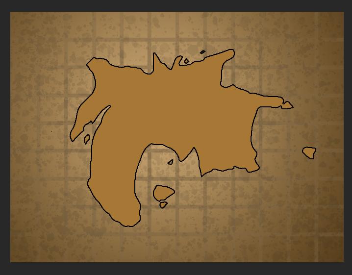
Finally, I import the map and used a different colour this time so that it is eye-catching and it is bold enough to see the map itself. In my opinion, the map looks very appealing and the different shades of colours that have been used effectively and ensure that the map stood out the most. If I were to improve, would try imported some mountains to the map and some other different environment to see where everything is at.
