Task

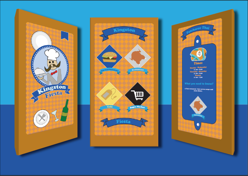
These images have been created from the prototype application that I made in Abobe XD. With the skills that I have for Illustrator, the kiosk will be done in 10 minutes.
I have chosen the splash screen, the selection page and the information page because I believe that these are vital information that I want to display to the public so that they will be able to understand what is my kiosk is about.

Since I needed to make my rectangle to look 3D, I would to go on the extrude and bevel option and make sure that the setting is correct for each individual shape. In order for my images to be aligned within the new 3D environment, I would have to convert the image to a symbol so that when I am going to the map art, I can input the symbol so that it forms a kiosk.

I just realise that my design blends with the background and that does not look as appealing and shows it is lack of creativity to my work. I might play around the colours and use the colours that I have used for my app design to show my consistency with my work.
Even though it is a slight improvement, it still blends with the darker blue so I might decrease the blue to a more grey area so that it is easy to see that the colours are not blending.

The grey blues standouts and it works very well, however, I still want the pattern design to appear on the background as I have used it on my app design and I do want the design for my kiosk to look interesting so may consider playing around the colour.

I like the pattern on the background with the new colour but I still think that the colours should be switch around so that I have a different perspective on the design and by making that decision, my design will look aesthetically pleasing.

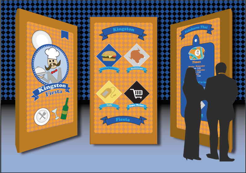
Blending with black with the grey-blue is a good idea and when I have that linked up with the pattern design, it will make the kiosk stand out even more but also making the background engaging to view upon.
Overall
The appearance is appealing and the simple design is easy to read. The colours that have been used here is efficient and the colours compliment each other well as they are complementary. In order for me to improve, I could do my own illustration of a person interacting with the kiosk or do some extra detail on the kiosk so that it could interesting to view upon by other people.
