Task
For the leaflet designs, I had to produce 6 different ideas for the leaflet design and I had to link it to the theme that I have chosen which is food. I had some inspiration at Pinterest and I had a go with some drawing of different food and some information boxes to make it more creative and unique. Even though they are in bad quality, I could play around in illustrator and make sure the lines are smooth or create a lineless art that would be appealing toward the audience. I might not use the exact idea but when I could pick a page that I like and combine it together to form a leaflet. When producing ideas, I realise that the order of the leaflet was slightly wrong, however, when I am designing in illustrator, I can rearrange the order that it is in.

Ideas Development

I perform a draft version of a leaflet to see I can like it, however, I can’t seem to improve my ideas since it is simple. I might play around in illustrator with the tool that is given to me. I am not a big fan of the anatomy of the figure is the proposition is uneven but perhaps I could configure the size in illustrator.

For the information that I want to put in, I personally like the top 2 as it gives a sense of uniqueness and the design make it look delightful and suits within the theme that I am working. On the other hand, I might have to consider the design for the bottom box as I am trying to portray a rating system of how this leaflet is good or not but not a lot of people would have understood what it means so perhaps I need to reconsider what to change about the design of it.

First Draft

This is the front page of my leaflet. The design aspect with the front page is simple and I really like how the smooth the plates are and the colour used in them is presentable. However, the front page does not presentable and some of the fruits does not look even. I had a look at examples of leaflet design and it does not look like a professional standard.
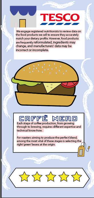
For the back page, the white brushes help enhance the visual aspect with the idea of the page and the two information boxes really give off a nice touch to the page. On the other hand, the bottom box with the start does not fit within the theme of my interactive map so I might have to consider what I need to change for the bottom part of my back page.
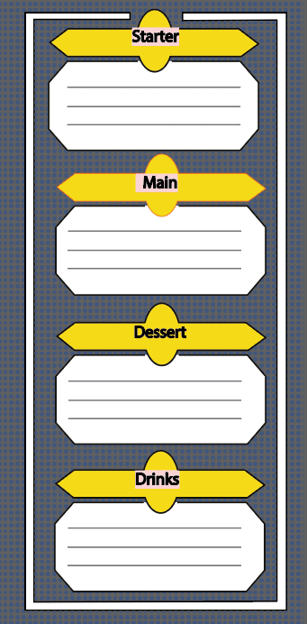
Lastly, this was meant to represent a menu so that when the person is using this leaflet, they are able to write down what they would have for each section. However, I realise that the map has no information and if I were to apply the information onto the map, it would look compressed and would not look appealing towards the viewer so I might have to consider a new design that would look appealing and would share information about the map.
Finalise Draft
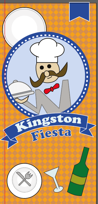
This is a much improved first page that before and it appeals more attractive with its visual aspect. For the other pages, I would make sure that they have the same background as the map as it brings continuity to the work and it is easy to read. I changed the typography to Cooper Std as it brings a bold appearance fits within the theme that I am displaying. With the waiter design, I used the one that I have created on the map and use it on the main cover so that I do not have to overcomplicate the design of my leaflet. Finally, I consider having white stroke lines around the blue circle to give my style of the leaflet a sense of uniqueness.

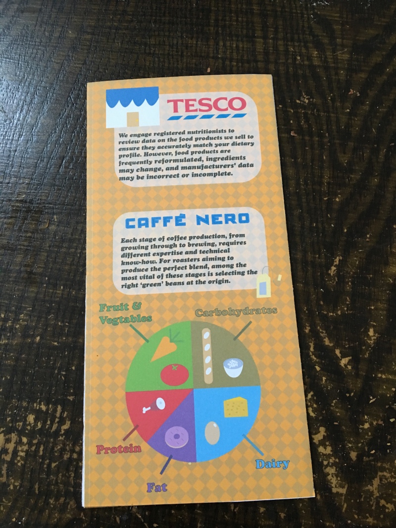
For the back page, I kept the top two information boxes due to the fact that I personally like the design but I just need to make some slight adjustment to their design as their previous design was not smooth. As it was a food theme leaflet, a food cycle would recommend best for the leaflet and I believe that it can be educational for other people who do not know the names or what is inside the food cycle. The illustration is lineless but it works effectively because even though that the design is simple, the food is easy to identify and it is aesthetically pleasing.

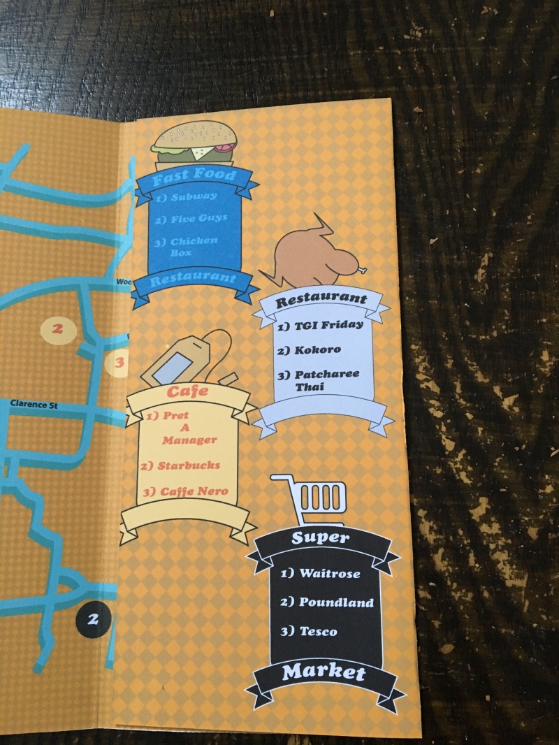
For the inside page, designing banners for each information about the map was a good idea as people will be able to identify where each location is on the map. The reason why I have colour coded each section in different colours because people tend to find information if it was colour coded and it is a faster way to spot different information. Refined the logos for each section is very amusing and satisfying to view.
Printed Version

This is what my leaflet would have looked like if it was printed on an A3 paper. On the paper, you could see lines that would fold the pages. This was a problem that I can easily fix on illustrator by making the whole template have the background rather than having for each page as it will cause difficulties later on.
Conclusion


Overall, I like how my work was able to improve and the visual aspect is charming. The information was not too much and kept it consistent so that people know what is going on that page. The first page looks like a menu and since my theme is food, it works perfectly and I believe that it has reached the criteria. If I were to improve on this leaflet, I would make sure that I add more information to the map such as time and the synopsis of the location name so that whoever is reading this will have a better understanding of what that place is.
