Poster 1

I’ve set the grid to a rule of thirds to make easier to place images inside that grid.
Then I decided to use a sea background to present the river and I would later add a bridge on top of the background to make it look realistic. Also, I make sure that the title is on the top the grid and make sure that I change the option to from normal to the screen so that it blends with the sea.

I changed the sea background as it was dark and I wanted that background to be brighter so that the text is clearer. Then I use a cobblestone background to represent the pathway of the bridge. Afterwards, I use the pen tool to draw the fence which makes the design look interesting. I also added the date on the top left corner of the poster design.

Finally, I added the bike which I placed in middle and by doing this, it fits really well. Then I placed the “EGX” logo on the bottom left corner so that it images is clear on the poster.
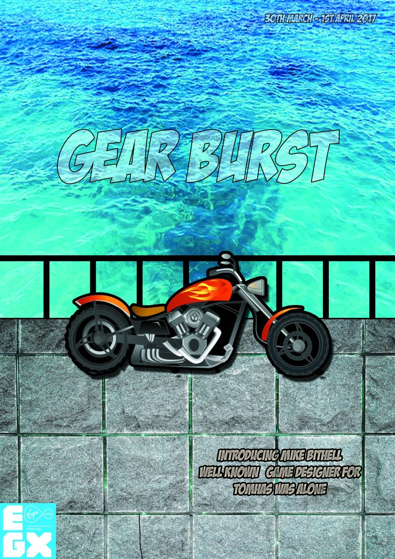
Overall, the presentation of the poster is aesthetically pleasing and the colour scheme blends really well with the sea and cobblestone background. The bike gives a cartoonist look which applies to my car racing game. Then there is an introduction to the game develop, which people will be willing to know what game they have created and what’s their journey during the development. To improve, I need to make sure that the date is brighter and bigger so it is more clear for the players to see. Also, I need to import one of my design to this poster to advertise my own game to the poster.
Poster 2

First of all, I used a pink and black gradient tool to cover the background. By using this colours scheme, it gives an interesting concept.

Then I placed the EGX logo on the bottom left corner and I used a gradient tool to make it different from the background. I also added a stroke to the logo to make it stand out.

Whilst using the grid, I used the text tool to place inside the grid to place all the information for the EXPO convention.

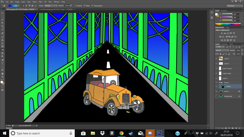
Then I placed my own design in the bottom right corner to advertise my own car racing game.

Finally, I added the logo of my gear to advertise my own car racing game.

Overall, the presentation is really colourful and how the light colours juxtapose against the dark colours works really well. The way the composited the text on the poster is to align really well and it makes the poster look professional. You are able to see the where the convention is and when it is going to beat. The information does not overlap with each other and it is easy to read. To improve, I should make my design of my character have an outer glow to make it even stand out more and change the style of my design to make it look professional.
More posters