Car Racing – HUD

What is a HUD?

HUD stands for Head-Up Display. They are used to show information to the player on what is happening in the game. In this case, a car racing game needs to include laps. maps and numbers of competitors in the race. Sometimes, they would include pick-up items for animated car racing game.

Moodboard

HUD moodboard.jpg

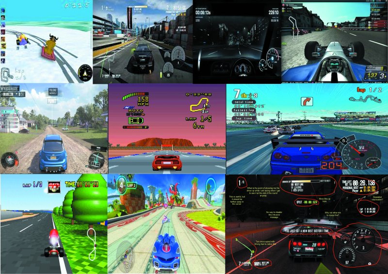
In this mood board, the hud has been positioned in different places so that the player can see what is happening in the game. Some HUDs are placed differently that would allow the players to get used to their game’s preferences of the HUD. What I need to do next is to try out different combination of the HUD so that it is not a bother to the players when playing the game.

Colour Swatch

Colour swatch for hud.png

This is going to be the colour swatch that I will be using for my HUD. The reason why I would like to use primary and monochrome colours because I want to keep the HUD simple and I want to make sure it is not distracting the player whilst they are playing the game.

Draft Versions

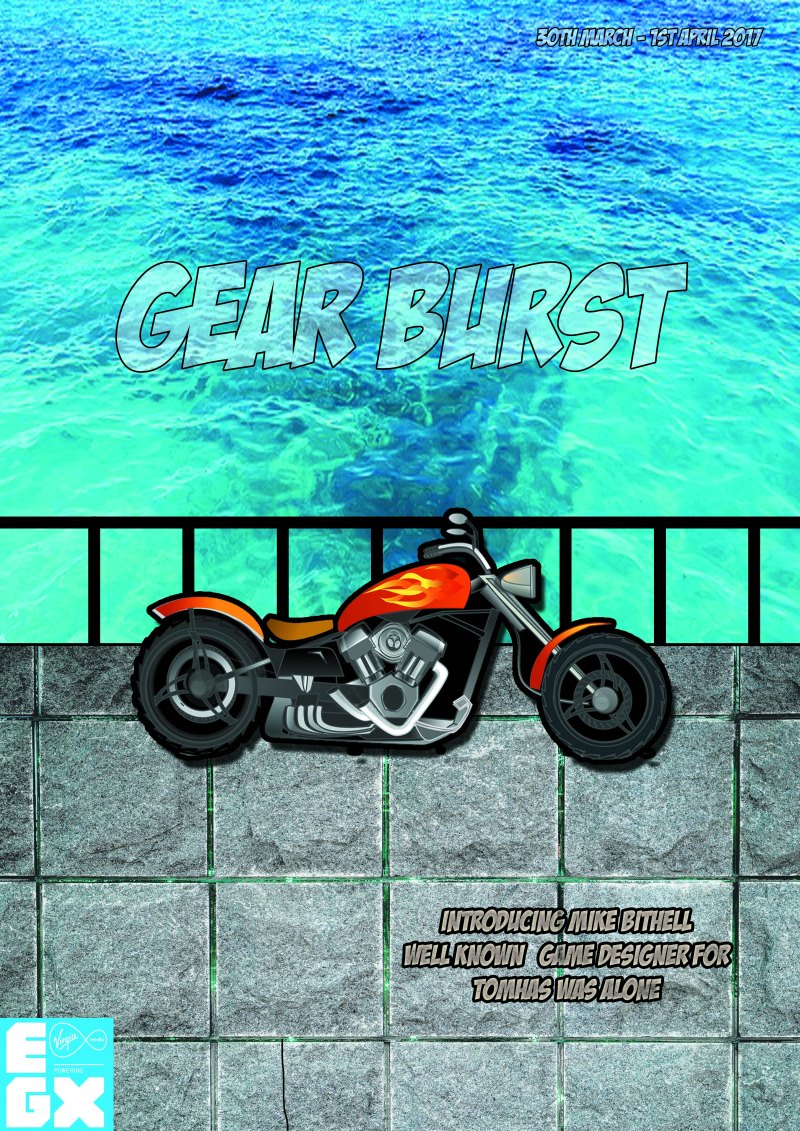
These are the different combination of the HUD so I might take into consideration of design it. I tried placing them at the top, bottom and sides and some of the combination work really well. I decided to go with option 2 as you are able to see where each HUD design is and they are evenly spaced out with each other. Also, it will allow the players to concentrate on the race and that they would even have enough time to look where they are going.
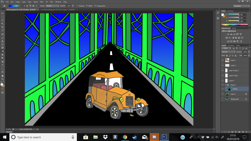
Concept art

I started doing the one-point perspective on the page and started designing the road and the bridge. Then using an HB pencil, I gently proceed to draw the structure from the vanishing point so that it the appearance looks attractive. Afterwards, I added details which could be suitable for the design for the HUD. Also, the features that are important in the HUD will be displayed on the page where the audience can see what the game looks like.

I used felt tips pens to make the gameplay stand out and the use of colours used to display the HUD is colourful and attractive. I made sure that the HUD is clearly visible and it is easy to look at. The audience will be able to tell that this is a car racing game.
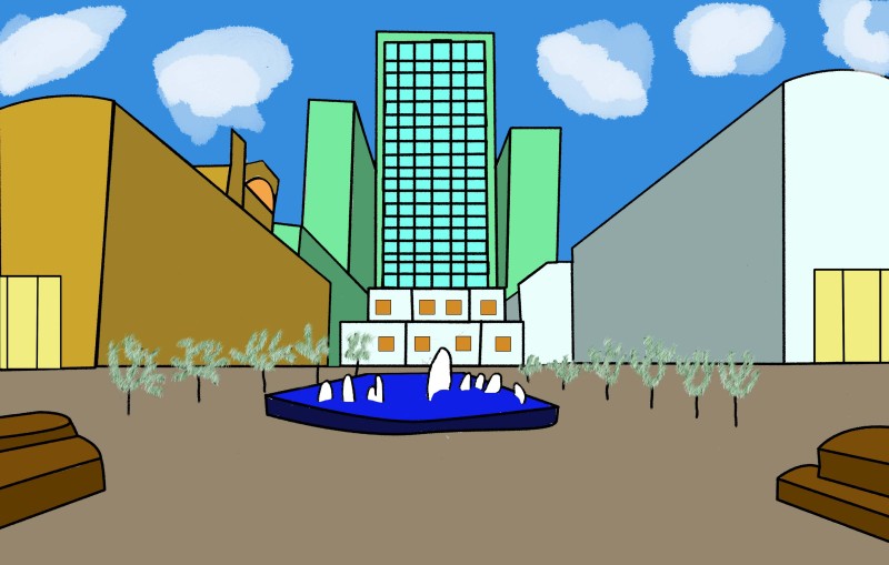
Digitalise

HUD JPEG

I scan and digitalise the image whilst using Photoshop. By digitalising this artwork, the audience is able to understand what the general aspect of the game looks. I made sure that it is in 3rd person view as you can see the track and the character as well. This track is meant to show the character going through Tower Bridge and there is a waterfall coming from the top of the bridge.

Car Racing – Controls

These are different platforms that I would be using to display my games. Even though I am using well-known platforms to advertise my game, I am going to include my own controller to make it my own originality.

PS4

Xbox One

Nintendo Switch

My own controller

Screenshot (68)

I have designed the controllers that I think it would be suitable for my car racing game. I made sure that the controller is like a steering wheel to ensure that the player is part of the game. I have set the controls on the top of the controllers and I make sure that there are triggers at the back of controller so that the players have an easy access of where each button is on the controller.


Poster Designs

Poster 1

Screenshot (11)

I’ve set the grid to a rule of thirds to make easier to place images inside that grid.

Screenshot (12).png

Then I decided to use a sea background to present the river and I would later add a bridge on top of the background to make it look realistic. Also, I make sure that the title is on the top the grid and make sure that I change the option to from normal to the screen so that it blends with the sea.

Screenshot (13)

I changed the sea background as it was dark and I wanted that background to be brighter so that the text is clearer. Then I use a cobblestone background to represent the pathway of the bridge. Afterwards, I use the pen tool to draw the fence which makes the design look interesting. I also added the date on the top left corner of the poster design.

Screenshot (14)

Finally, I added the bike which I placed in middle and by doing this, it fits really well.  Then I placed the “EGX” logo on the bottom left corner so that it images is clear on the poster.

Poster design 1.jpg

Overall, the presentation of the poster is aesthetically pleasing and the colour scheme blends really well with the sea and cobblestone background. The bike gives a cartoonist look which applies to my car racing game. Then there is an introduction to the game develop, which people will be willing to know what game they have created and what’s their journey during the development. To improve, I need to make sure that the date is brighter and bigger so it is more clear for the players to see. Also, I need to import one of my design to this poster to advertise my own game to the poster.


Poster 2

Screenshot (69)

First of all, I used a pink and black gradient tool to cover the background. By using this colours scheme, it gives an interesting concept.

Screenshot (71)

Then I placed the EGX logo on the bottom left corner and I used a gradient tool to make it different from the background. I also added a stroke to the logo to make it stand out.

Screenshot (72)

Whilst using the grid, I used the text tool to place inside the grid to place all the information for the EXPO convention.

Screenshot (73)

Then I placed my own design in the bottom right corner to advertise my own car racing game.

Screenshot (75).png

Finally, I added the logo of my gear to advertise my own car racing game.

Poster 2 (1).jpg

Overall, the presentation is really colourful and how the light colours juxtapose against the dark colours works really well. The way the composited the text on the poster is to align really well and it makes the poster look professional.  You are able to see the where the convention is and when it is going to beat. The information does not overlap with each other and it is easy to read. To improve, I should make my design of my character have an outer glow to make it even stand out more and change the style of my design to make it look professional.

More posters

Screenshot (89)Screenshot (91)Screenshot (98)Screenshot (92)

Screenshot (102)

Screenshot (95)


Car Racing – Car


Drawing

This is an attempt of refining a Vintage under 10 minutes. The design of the Vintage looks good and you are able to identify which car this is. However, I could have done this in a point perspective to make it realistic.

This is an attempt on drawing a sports car. I found it really difficult on drawing this as it involves curved lines and the wheel needs to be in a certain place, which makes this drawing harder to draw. To improve, I would need to draw a couple of draft versions of sports cars until I am happy with the draft version and I can refined it in Photoshop.

This is an attempt on drawing a London Bus using one point perspective. The design of the bus look appealing and it looks realistic. To improve, I would need to refine the bus and the lines needs to be smooth rather than being rigged.

Then I drew 2 different sides of the Vintage in different style. One of design is done by colouring pencils and extra details and the other one is done by felt tips. I personally like the bottom left design as it looks realistic.

Digitalise

Car (Photo).jpg

I digitalise one of Vintage. I used the pen tool  to trace the outline and I would use the paint bucket tool to colour the Vintage. As I wanted the extra detail that I have done to the vintage, I’ve lowered the opacity so it keeps its colour scheme, the outline and the extra details. I personally believe that design is really good and it looks really realistic.

Car Racing – Environments

Drawing

This is an attempt on Tower bridge without using any point perspective. Even though it looks relatively good, I would use a point perspective to make it realistic.

This drawing shows a part of Oxford Circus where the shopping hall is. Even though I didn’t use a point perspective, I need to do another drawing of Oxford Circus using a point perspective.

This is Oxford Circus whilst using two-point perspective. It is a better improvement than the previous drawing of Oxford Circus, however, the middle building is slightly off which more to the left side than the middle. If I were to do this again, I would make sure that each measurement is correct to make it realistic.

This is a picture of Wimbledon where you see the side of Morrison using a one-point perspective.


This is an attempt at using two-point perspective on a two-way road. The reason why I have chosen this to draw is that it looks interesting to look at.

This is a one-point perspective drawing of Canary Wharf showing its architectures.

I took pictures around Kingston so that I have resources when linking to the theme of London. The objects that I’ve captured are seen most commonly shown in London, for example, post box and a London bus. Once, I have collected good samples of the objects and buildings, then I would pick 5 samples that would link to London and cut them to form an image. In this style of art, you have seen that the bus is going under a bridge which can be a used as a track.

Digitalise

Environments (Photo).jpg

I used one of the images that I have created for the environments. The design of Canary Wharf stands out and it gives the 3D aspect of the buildings. For tracing the outlines, I used the pen tool to ensure that I have straight smooth lines to make it a clear visual. Once I have traced the templated, I would use the paint bucket tool and coloured the shapes with different shades. This will help gives a 3D aspect when displaying the environments. I changed the brush styles and change the opacity to create clouds. The presentation the environment is pleasing and the use of colours is colourful. To improve, I could add a gradient to the sky to give it an interesting look.